Product Design / UX Research / UI Design
Spotify Web Player.
An independent concept exploring music discovery, interaction, and usability through research-led product design.
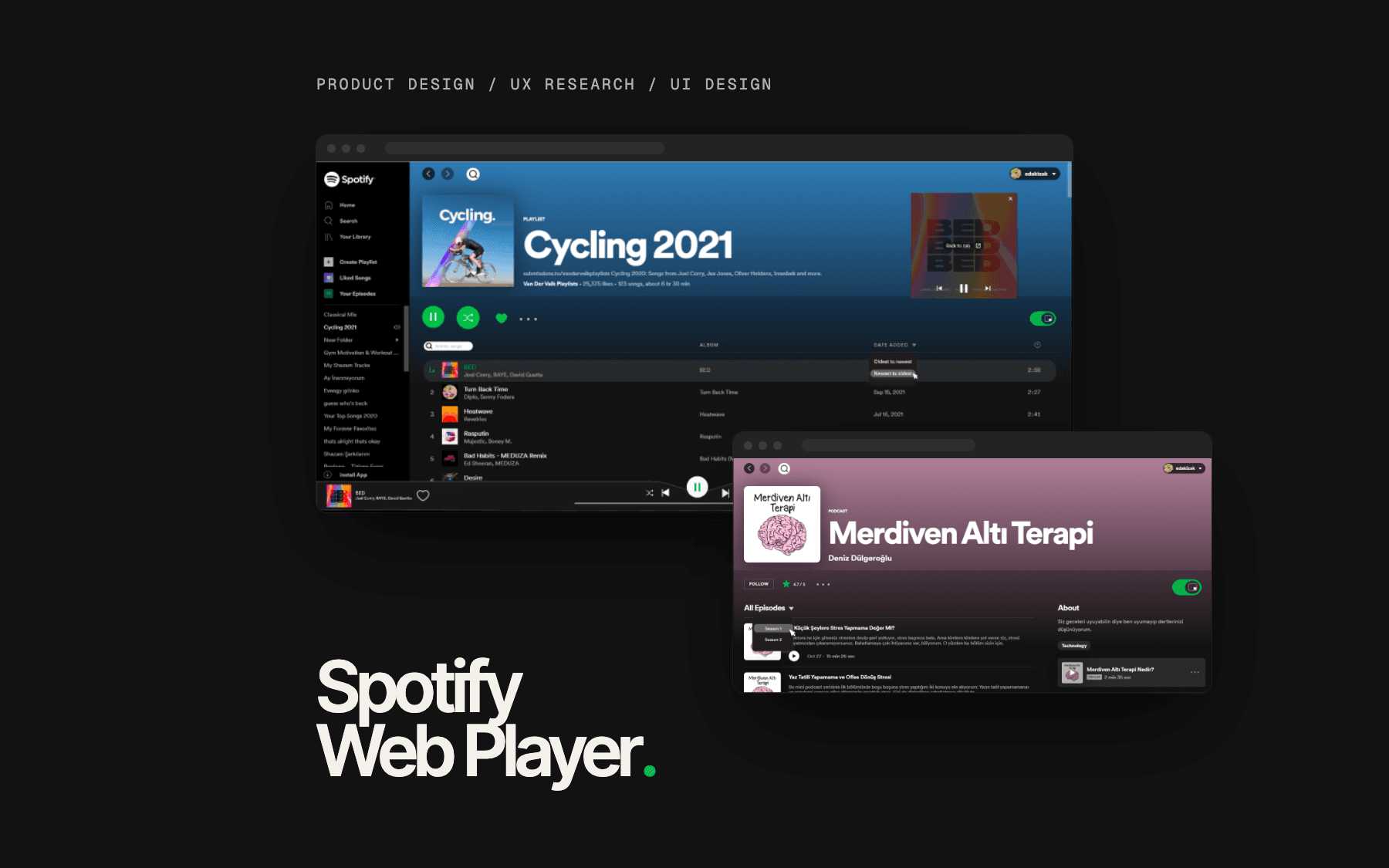
- Platform
- Concept for the Spotify Web Player (desktop)
Responsibilities
- Desk research
- User interviews
- Survey
- Affinity map
- Personas
- Information architecture
- User task flow
- Wireframes
- Visual design
(01) — Overview
Overview.
A concept for the Spotify Web Player.
Independent concept
A self-initiated design project. It is not affiliated with, commissioned by or endorsed by Spotify, and the redesigns were not implemented by Spotify.
Spotify is a music streaming platform that gives users access to a large catalog of music. Spotify implements a number of simple strategies with great effectiveness. Spotify’s mission is to give people access to all the music they want all the time - in a completely legal and accessible way.
Design Process
- 01
Discover
- User Interview
- Survey
- Desk Research
- 02
Define
- Persona
- Affinity Map
- 03
Ideate
- Information Architecture
- User Flow
- 04
Design
- Wireframes
- Visual Design
↺ back to Ideate
- 05
Testing
↺ back to Ideate
(02) — Problem
Problem.
Discovering new things, low interaction, easy usability.
For this project, conducting user research, knowing the business goals, and understanding the users' needs were key in helping Spotify achieve its goals better through adding features. I tried to find solutions to the shortcomings that I observed in terms of users discovering new things, low interaction, and easy usability.
(03) — Research
Research.
Reviews, 4 interviews, 14 survey responses.
1. Desk Research
Using data from reviewing previous research findings to gain a broad understanding of the field.
1 / 5 stars · March 17th, 2021
Not all its cracked up to be
Often cant find the songs, artists im after even with them being relatively mainstream, also as always with these big music and media company's overpriced and dodgy as the norm.
3 / 5 stars · Reviewed in the United States on October 24, 2021 · Verified Purchase
OK
Anytime I listen to a podcast, after I get hit with the commercials, it loops back to the beginning on the show. Android Galaxy. Good news is I can turn off screen and listen, unlike Youtube. Interface is not as organized or simple as expected. Much better experience on my desktop using Chrome. Even Opera sputters.
3 / 5 stars · Invited · Sep 12, 2021
The app is not user friendly
The app is not user friendly. It's hard to navigate and it's not intuitive.
5 / 5 stars · Oct 17, 2021
Great for podcasts
I have been using spotify for a few months now and with the podcasts you barely notice them. The podcasts play from oldest to newest some other apps go backwards after you finish an epsiode which I found confusing.
2. Qualitative Research
I interviewed 4 users on video calls to understand the challenges they face with using Spotify Web Player. A few sample tasks are listed below.
- Please open the personal playlist and listened mostly
- Choose a song according to your mood
- Open <X> artist’s <Y> song
- Define the titles on the home page
- Start <X> episode of <Y> podcast
3. Quantitative Research
I did an online survey using Google Forms to collect data from the target audience to get information and to observe any pattern that they may want. A total of 14 people responded in this section, the results of this survey are:
- Yes86%
- Sometimes14%
- Everyday29%
- More than once43%
- Less than once29%
- Yes71%
- No29%
- Medium57%
- Easy21%
- Very easy21%
- Yes86%
- No14%
- Always71%
- Sometimes7%
- Never21%
7. Is there an experience on the Spotify web app that doesn't make you happy?
- It's hard to discover new things
- When creating a playlist, finding similar songs and adding them to the same list
- The user profile section can be improved, and information about followers can be accessible
- Not being able to see all the songs of the artists in a single list
- Not being able to see who is following the lists
8. Which feature would you be happy to have in the Spotify web app?
- Podcast recommendations and categories should be more
- Categories should be more specific / confusing home page
- The "Show Credits" section is used completely and accurately for each piece.
- Discovering new things and interaction
- I would like it if it was interactive with the interactions you follow or your friend's shares, suggestions, etc
- Rating
(04) — Key Insights
Key Insights.
- 01
Although users said that they could easily find what they were looking for in the application, they stated that they had deficiencies in discovering new things and interacting. While creating a new playlist is easy, they mentioned the pain points of adding songs and finding similar songs within the list.
- 02
The majority of users are using the shuffle feature, which is not currently easy to use and visible considering my heuristic approach.
- 03
While Spotify users can easily use the application for basic actions, they have difficulty in dynamic actions such as discovering or being aware of newness and interacting with other users.
- 04
Although the use of podcasts is quite common, the same solutions are offered with music. There are features in the two areas where it differs.
(05) — Define
Define.
Affinity map and two personas.
1. Affinity Map
Using data from review previous research findings to gain a broad understanding of the field.
- Users are having trouble finding their personal playlists
- They make a playlist and forget
- They prefer playlists they listened to last
Affinity map centred on Spotify.
- They said the podcast is less visible on the homepage
- They didn't see the top podcast criteria
- If they want to start from the first section, they scroll to the end of the page
- They said the search button is not visible
- Mostly they searched by song names
- They wanted to see recently searched but couldn't see
2. Persona
As a result of the research and the data, I've gathered from them, I have come up with two types of potential Spotify Web Player users. Elsa helped me to understand more deeply the different uses of the app. On the other hand, John helped me create better solutions to increase the interaction in the application and increase the ability of users to discover within the application.
Elsa
Brand Manager, 34
#hardworker #explorer #confident
“Music is not the goal for me it's always something in the background”
About
Elsa has been working as a Brand Manager in a corporate company for 12 years. She likes to listen to calm music for the rest of the day, where she attends a lot of meetings during the day. Listening to music is a background sound for her. She prefers listening to podcasts more than music to follow new trends and to improve herself about personal development.
Needs
- Faster access to podcasts of interest
- She wants to listen to music according to her mode
- Making consistent playlists and listening to music from them
Frustrations
- Since music and podcasts are in the same areas in the application, she has trouble finding what she is looking for.
- Having so many options on the homepage makes her difficult to decide.
- When she listens to music from other lists, the visibility of her playlists in the application decreases
John
Jr. Game Designer, 23
#extroverted #passionate #tech-geek
“A day without music is a day wasted”
About
John has been working as a game designer for 2 years. He loves to stay awake till morning and works at night. He spends most of his day in front of the computer and listens to music almost every time he is awake. While partying with his friends, music is usually played from his playlist.
Needs
- More people following his playlists
- Easier access to popular playlists
- Interact with music lovers from all over the world
Frustrations
- Repetition and not being able to discover new things
- Confused because there are so many recommendation lists in the app
- Limited interaction with others who use the app
(06) — Ideate
Ideate.
Where the new features live, and how people reach them.
1. Information Architecture
Informed by research, I created a revised map for Spotify Web Player, showing how the new feature would integrate within the existing architecture.
- Good Evening (changed feature)
- Your Shows (changed feature)feeds intoPodcast (new feature)
- Made for me (changed feature)Your Top Mixes (changed feature)feeds intoMixes (new feature)
- Recently Played (existing feature)
- Jump Back In (existing feature)
- Shows might like (changed feature)Recommended Radio (changed feature)More What You Lİke (changed feature)feeds intoRecommended (new feature)
- No Stress (existing feature)
- Pop (existing feature)
- Rock (existing feature)
- Friends Activities (new feature)
- Categories (new feature)
- Search (new feature)
- Your top genres (existing feature)
- Browse all (existing feature)
- Search (existing feature)
- Existing feature
- Changed feature
- New feature
2. User Task Flow
I focused on decreasing the processes needed for the main task, increasing the visibility of features, and providing users discover new things by simulating the redesigned flow.
Elsa wants to open the first season of the top rated podcast
- Home (screen)
- Select Podcasts category (action)
- Top Podcast (screen)
- Select top rated podcast (action)
- Top rated podcast's episodes (screen)
- Click to all episodes (action)
- Select the first season (action)
- Select the first episode of the first season (action)
Elsa wants to open all her playlists and open a specific song
- Side Bar (screen)
- Select my playlists' see all (action)
- My Playlists (screen)
- Select the playlist (action)
- The playlist page (screen)
- Search the song (action)
John wants to discover new things
- See friends' activities (action)
- Click on the song that a friend is listening (action)
- Play the song (screen)
- Select Artists category (action)
- Artists (screen)
- Select one of them (action)
- Artist's albums (screen)
- Select one of them (action)
- Playlist (screen)
- Click Shuffle (action)
- Discover (screen)
- Select Jazz (action)
- Jazz (screen)
- Play a song in New Releases (action)
- Screen
- Action
(07) — Product Decisions
Product Decisions.
From what users said to what changed.
“While Spotify users can easily use the application for basic actions, they have difficulty in dynamic actions such as discovering or being aware of newness and interacting with other users.”
Key insight
Home
Categories, friend activities and cards of different sizes
“While creating a new playlist is easy, they mentioned the pain points of adding songs and finding similar songs within the list.”
Key insight
Playlist
A search box and date-filtering in the playlist
“The majority of users are using the shuffle feature, which is not currently easy to use and visible considering my heuristic approach.”
Key insight
Playlist
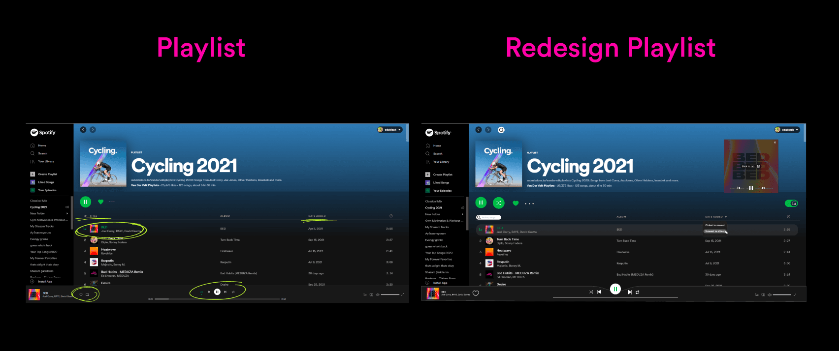
More visible shuffle and mini-player
“They said the search button is not visible”
Affinity map · Search
Search / Discover
A search box on the main pages, and a dedicated Discover page
“Users are having trouble finding their personal playlists”
Affinity map · Playlist
Sidebar
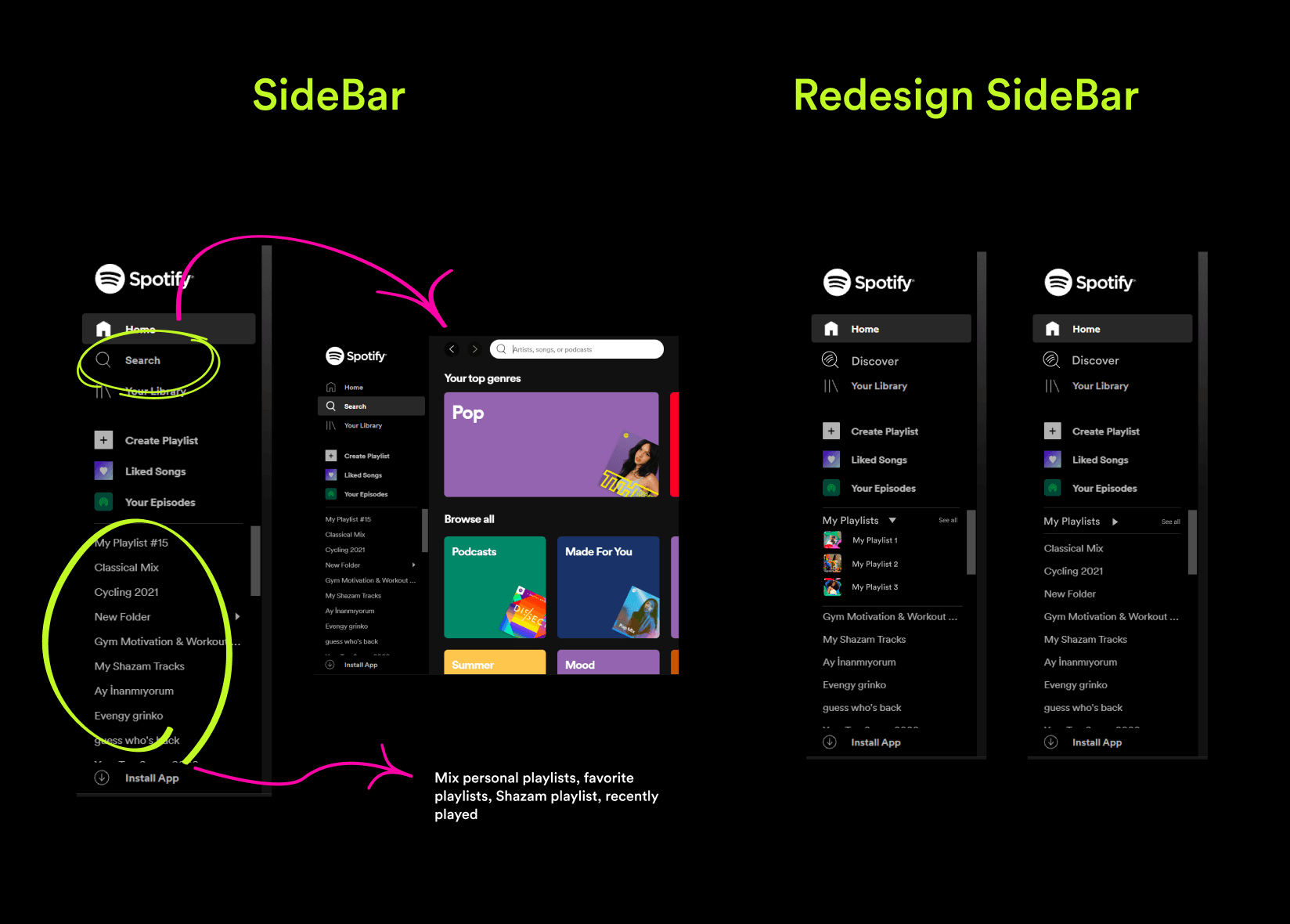
A My Playlists dropdown with a see-all option
“If they want to start from the first section, they scroll to the end of the page”
Affinity map · Podcast
Podcast
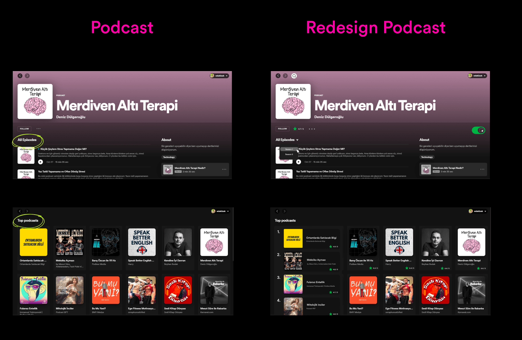
Top podcast ranking and rating, and a season filter
These are design responses, not validated results. User testing is the planned next step.
New Features
Priority features I have improved and added with the data I have obtained from the research I have done.
- 01
Home
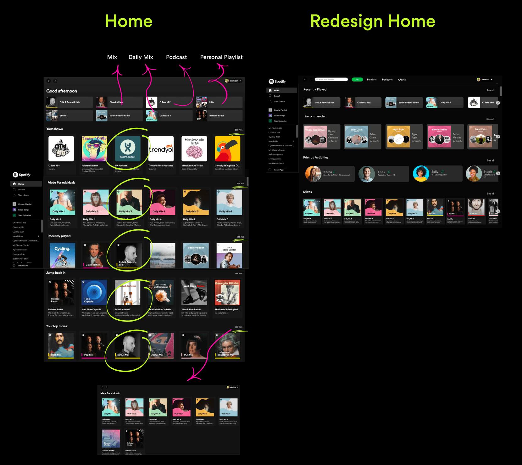
I wanted to increase the dynamism and interaction on the home page. I added categories and friend activities. I made the monotonous interface more dynamic with cards of different sizes.
- 02
Playlist
I made the shuffle and mini-player features more visible. I made it more specific about which song is playing in the playlist. I provided easy access by adding a search box and date-filtering features.
- 03
Search / Discover
I have provided accessibility by putting the search box on the main pages. I changed the name of the search page to discover because I noticed that users are confused when they see mood and new release titles on the search page. I thought it would be more consistent to customize this page to just discover.
- 04
Sidebar
I have observed that users have difficulty finding their personal playlists. Likewise, I noticed that the lists are mixed in the sidebar. I added a dropdown menu in the sidebar under the title of my playlists and with the see all option, I made it possible to access all their playlists easily.
- 05
Podcast
I noticed that the top podcast page within the podcast is not different from the main podcast page and does not offer any rating. I added top podcast ranking and rating. I also observed that users scroll a lot to reach the episode they are looking for. I added a seasoned filter to reduce this.
(08) — Design
Design.
System, structure, then surface.
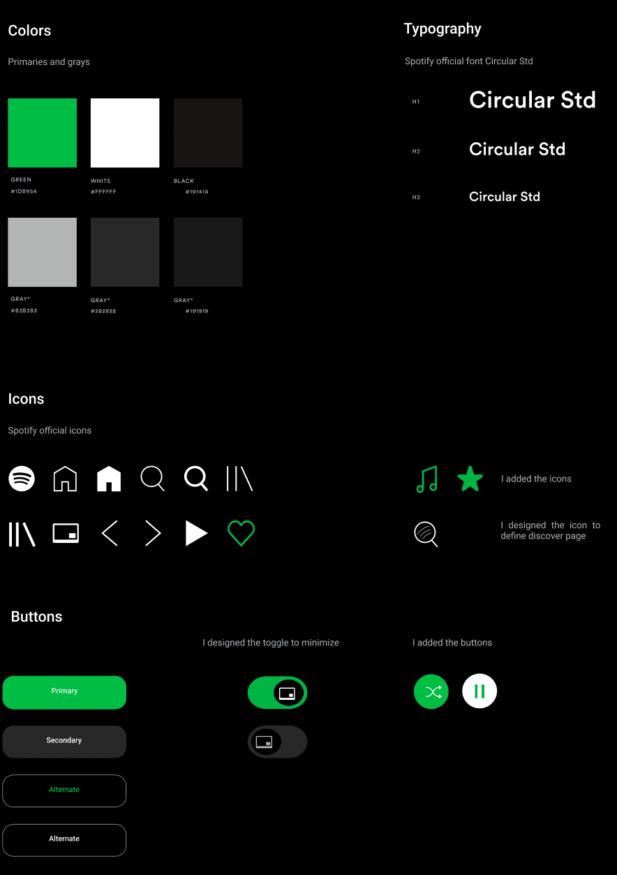
1. Design System
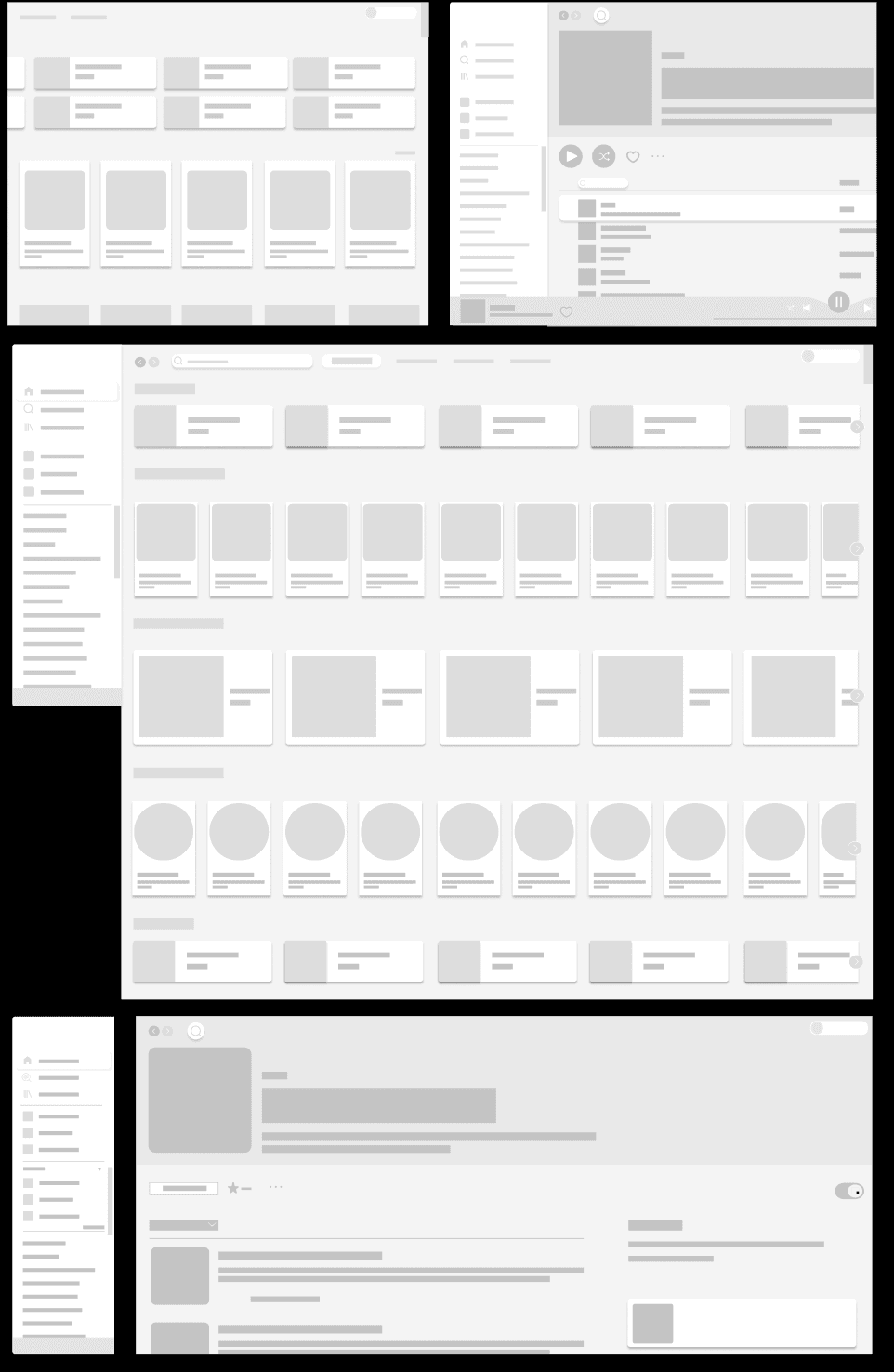
2. Wireframes
3. Visual Design
(09) — Next Steps
Next Steps.
Planned, not yet done.
In the next stage, I will evaluate the product by making user tests with users. I will iteratively improve the product by applying the feedback received. By reaching more users, I will validate the product and confirm the decisions.